How to Create a Webinar Invitation
Main Components of a Performing Email Invitation.

The main reason to attend any of your events (conference, webinar, workshop) is the topic of the event and the benefit people will have attending it. A live discussion of hot current topics hosting world-famous professionals and experts seems to be destined to gather dozens of registrations.
A good webinar invitation and smart email marketing, though, can help turn these dozens into hundreds. And even if people aren’t interested in the current event, your professionally looking campaign will make a good first impression, building you a reputation of a worthy presenter. This is crucial for brand image and recognition because you want to be associated with professionalism and competence, don’t you.
So what makes a good webinar invitation? Many things, but I’ll start with the one the recipients see first in their Inbox - the subject line.
Webinar Invitation Subject Line
A subject line determines to a great extent whether your emails will be opened. Its task is to catch the attention, ignite excitement and prompt an open.
As a rule, creativity is more than welcome when it comes to promos, sales, or holiday campaigns. But a webinar invitation is a specific email that has a set topic - webinar announcement - and aims to prompt a particular action - registration. And you’d better state it in the line for several purposes:
- Webinar mentioned in the subject line won’t let the target audience miss the email in their often stuffed Inboxes;
- People uninterested in webinars won’t be disappointed by opening messages that are currently irrelevant for them.
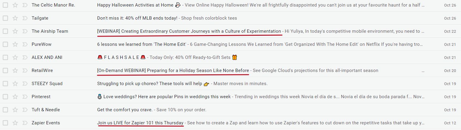
Also, after you’ve indicated the purpose of the email, write down the webinar name that’s often its topic shortened. Too general text may be not enough to prompt an open. Show from the start why your event is worth visiting.
Compare these two topics:
Join Us for More Inspiration for You and Your Work.
vs.
[FREE WEBINAR] Learn Unique Photoshop Tricks to Create Art with Double Exposures.
Obviously, the second variant is clearer and more detailed. It promises to teach you not some inexact techniques but a particular skill: how to edit photos in Photoshop and work with double exposures. And I believe it’s more likely to generate response.
Banner
A banner is an email element that comes on top of the email copy. Its design will depend on the current offer and your type of business. B2B and B2C webinar invitations may look rather different.
A webinar banner can include:
- Webinar topic;
- Date and time;
- Speaker(s), preferably with a photo and position;
- Host (if you have multiple speakers, or your webinar will be held as a Q&A session);
- Corporate name and logo;
- Background image;
- Registration button.
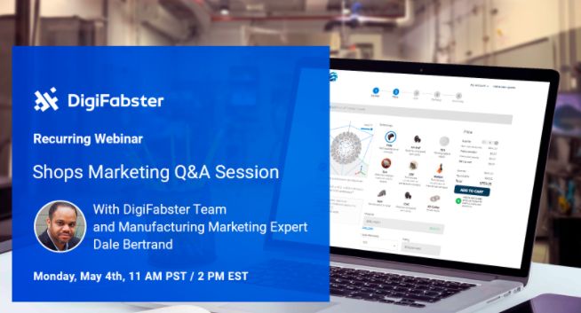
Although it looks like a lot of information, your task is to organize it short and clear. Your banner should contain only essential pieces and be easy to digest. It should take a second to scan and understand whether the email is worth reading further. Don’t turn your banners into a heavy mass. You’ll be able to specify all relevant details in the copy below.
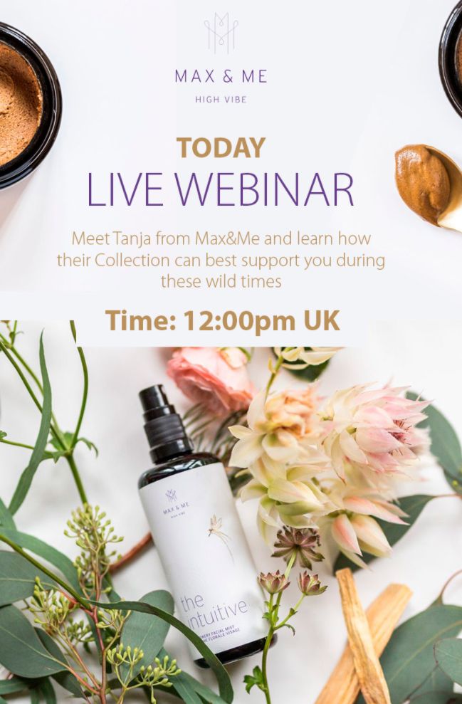
Banners for a B2C webinar invitation can be less informative and more visually appealing. Beautiful design with quality images prevails over a formal corporate style. Or there may be no banner as such, and all the details will be given in the body.
Body
If you create your webinar invitations with a banner (which contains main info), use the body to tell about the points that will be covered. If you skip the banner, first give the basic info (topic, time, speakers) and then move to main points anyway.
Explain what the attendee will learn and how they will be able to implement this knowledge in practice. Avoid long paragraphs and heavy wording though. I would recommend adding a bulleted list of key takeaways: they are fast to scan without losing the focus and interest.
Compare these two invitation emails and tell which body is more structured and easier to read:
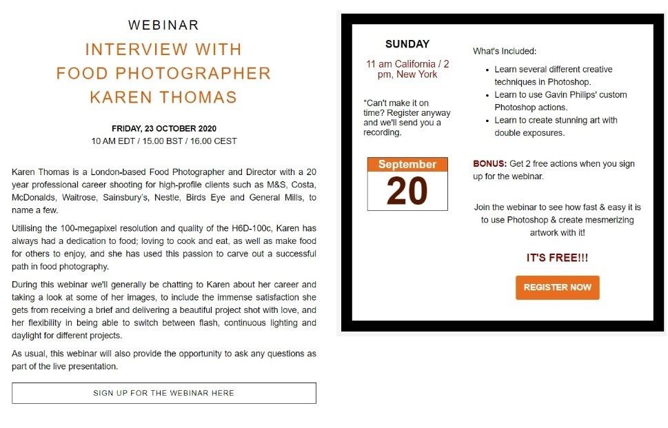
I’m pretty sure your answer is the one on the right. A two-column layout, short sentences and a bulleted list make it more reader-friendly and eventually more effective.
CTA
It’s no-brainer that a registration button is a must component of a webinar invitation. It should be noticeable and easy to spot. I wouldn’t recommend experimenting with text. Register, Join Event, Save Your Seat are the most optimal variants to stick to, and people expect to see them in your invitation.
As for the color palette, it’s up to you to choose colors that either follow your corporate style or resonate with the particular campaign design. Whatever you choose, they should stand against the background and shouldn’t merge with other elements.
You can place your registration button on the banner, if you use it, or under the main info. If your invitation copy is long, consider adding two buttons - on top and bottom - to simplify email navigation. This way, people won’t need to scroll all the way back to the top after reading all details, speaker presentation and location description.
Follow-Up Emails
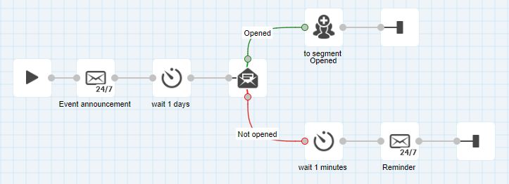
You can invite people to join you with a series of webinar invitations, sending them after a certain interval. To make sure that people who’ve already registered don’t receive the same message again, add to your workflow a condition: send reminders to only those who have ignored the first email.
Apart from actually invitation and reminders, there are also a number of emails you can consider adding to your webinar strategy:
- Registration confirmation with a thank you;
- Event reminder to inform that the webinar starts in # days/hours;
- Thanks for attending with a link to the recording;
- Post-webinar survey to find out attendees’s opinion.
What’s more, if you run omnichannel marketing, use other communication channels (SMS, web push, mobile push) to keep people up to date with current updates of the event.
To sum up, informational value should be the main characteristic of your webinar invitation. Make sure you enlist all the details (preferably in an easy-to-read format), add a noticeable registration button, include contacts and send your invitations way in advance. People should have enough time to think over your offer and squeeze it in their schedule.
and test them on dozens of different devises and mail apps START NOW