Dark Mode Nightmares in Email
Dealing with Dark Mode in HTML Emails.
Quite a large number of systems and email clients now support Dark Mode. And there are many myths, fears, and misunderstandings surrounding this. If you objectively assess the situation with dark mode in email development, then there is no single universal solution that would help you create a template that would be adequately displayed for recipients with light and dark mode.
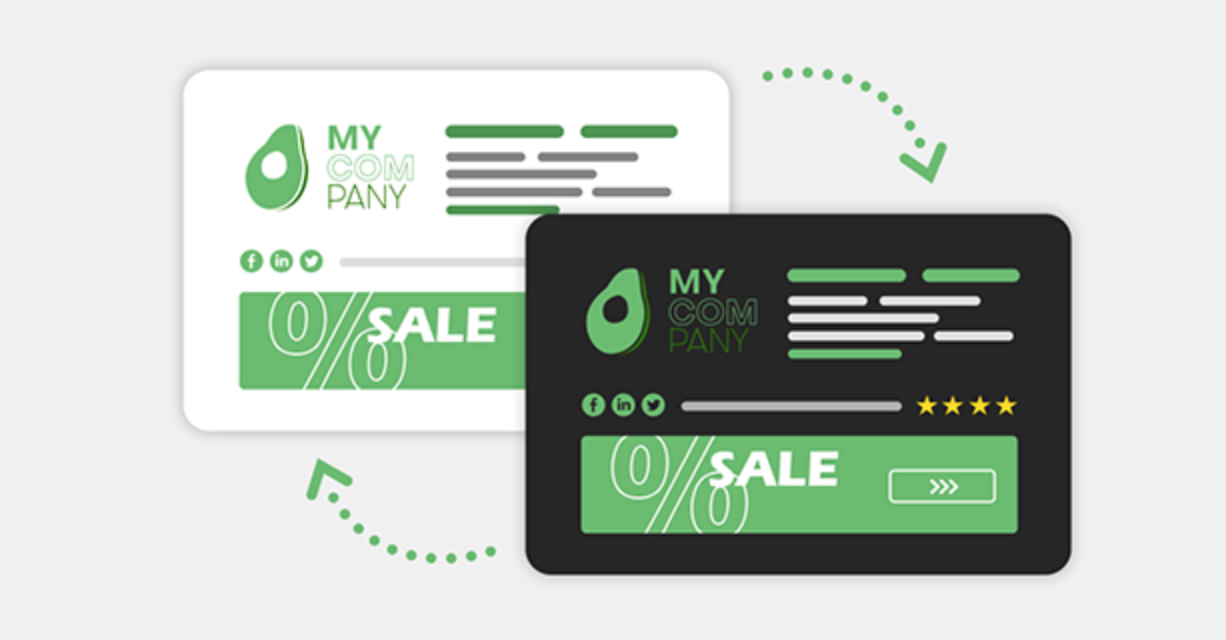
In this article, I will provide a number of methods that will help you create an email template for dark mode. Again, what is described in the article is not a vaccine for all diseases associated with Dark Mode in HTML email, but I am sure it will be useful to you in solving this problem.
Dark Mode and Email Clients
Mail applications when they switch your email to dark mode invert the colors. And, of course, they don't ask for your permission.
This table shows how the most popular email clients translate your message for viewing in dark mode:
| Email Client | Dark UI | Auto-invert email colors | Support @media (prefer-color-scheme) |
|---|---|---|---|
| Apple Mail, iOS, iPadOS | 1 |
||
| Apple Mail, macOS Big Sur | 1 |
||
| Gmail, Android | |||
| Gmail, iOS 14 | |||
| Gmail, Web | |||
| Outlook, iOS 14 | 2 |
||
| Outlook, Android | 2 |
||
| Outlook 365, Windows 10 | 2 |
||
| Outlook 365, macOS Big Sur | 2 |
||
| Yahoo, Web | |||
| Outlook.com, Web | 2 |
||
| Windows Mail, Windows 10 | 2 |
1 If transparent background;
2 Forced if not already dark.
Working with Dark Mode
Prepare images for two modes: dark and light.
If you realize that your logo, for example, will look bad on a dark background, make small changes to it. It can be an external glow around the logo or something else. Don't be lazy, spend some time on this; it will definitely bring a positive result. For images that are not rectangular, use transparency instead of a solid background. This may mean using PNG instead of JPG.
Also, you can deal with this problem by using display: none. This method works fine on the dark logo software of all modern email clients but not in Outlook and Windows Mail.
<style>
  @media (prefers-color-scheme: dark) {
    .darkLogo {
      display: none !important;
    }

    .lightLogoWrapper,
    .lightLogo {
      display: block !important;
    }
  }
</style><image src="dark-logo.png" class="darkLogo" />
<!--
To hide the light logo perfectly in Outlook and Windows 10 Mail,
you need to wrap the light logo image tag with a div.
-->
<div class="lightLogoWrapper" style="mso-hide: all; display: none">
<image src="light-logo.png" class="lightLogo" style="display: none" />
</div>Add these lines to your code.
The specified meta tags ensure that dark mode is enabled if your user has this option applied.
<meta name="color-scheme" content="light dark">
<meta name="supported-color-schemes" content="light dark">
<style type="text/css">
:root {
  color-scheme: light dark;
  supported-color-schemes: light dark;
}
</style>
Make sure that the following code is in your CSS block.
For example, maybe instead of absolute Black, you want the email to use the specific Black value of your brand.
@media (prefers-color-scheme: dark ) {
  .body {
    background-color: #172430 !important;
    color: #ffffff  !important;
  }

  h1, h2, h3, p, td {
    color: #ffffff !important;
  }
}
If the dark mode styles in Outlook for Android are important to you, then you can use [data-ogsc] to apply dark styles.
[data-ogsc] .darkMode { background-color: #34495E !important; }Text in Dark Mode.
I have two tips for you here. Don't put all the text in images. While putting text content in images seems like an easy way to get access to email clients, it creates email access issues for subscribers. Avoid placing pure white text on a pure black background. Since many users choose dark mode to ease eye strain, it's important to make sure that your dark mode color schemes don't affect your eyes much.
and test them on dozens of different devises and mail apps START NOW

Dark Mode Email Testing
There is no 100% understanding of how to create a template that is suitable for both Light Mode and Dark Mode. Some methods work for some email clients, but, for others, this is just not going to work. Therefore, it is important to test your templates before sending them to customers. Email2Go is a great tool for previewing your emails. In order to see how the created templates look in Dark Mode, you need to go to the "Preview" tab in the HTML Email Template Builder:
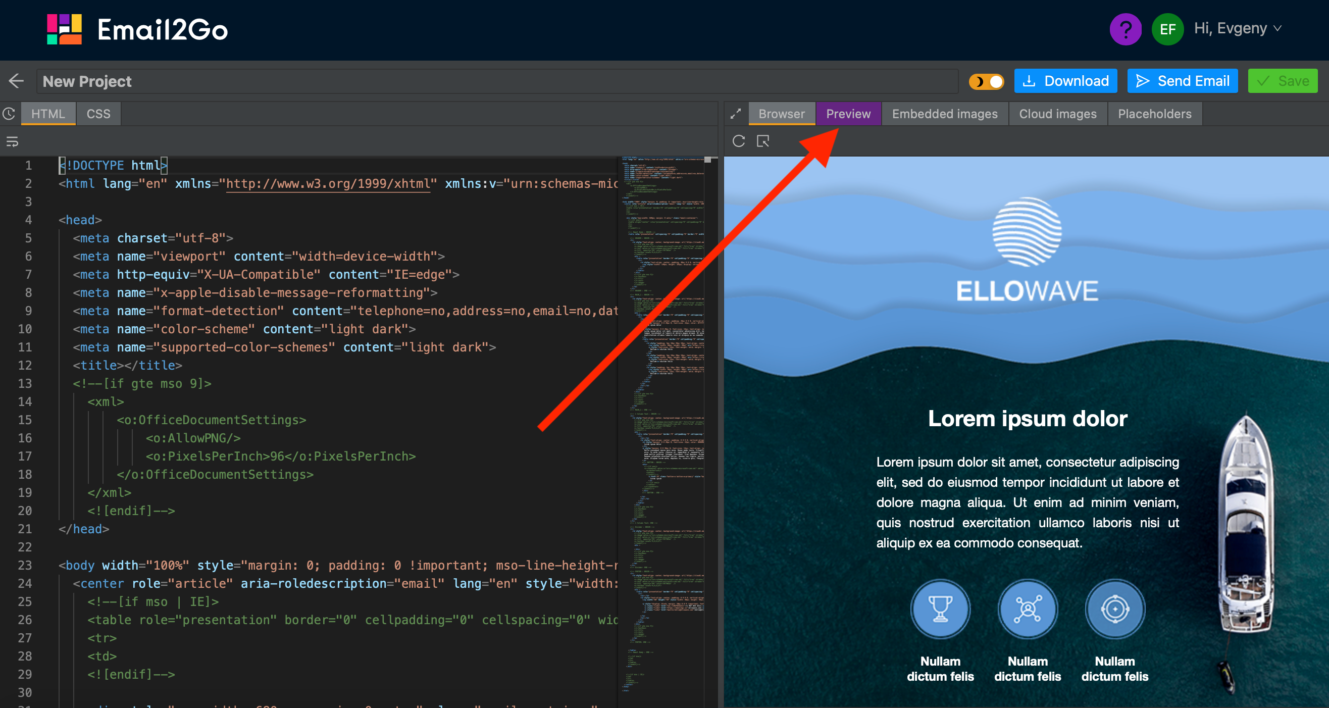 HTML email builder Email2Go
Then make renderings of your email template on all possible devices and apps or select specific devices that you need:
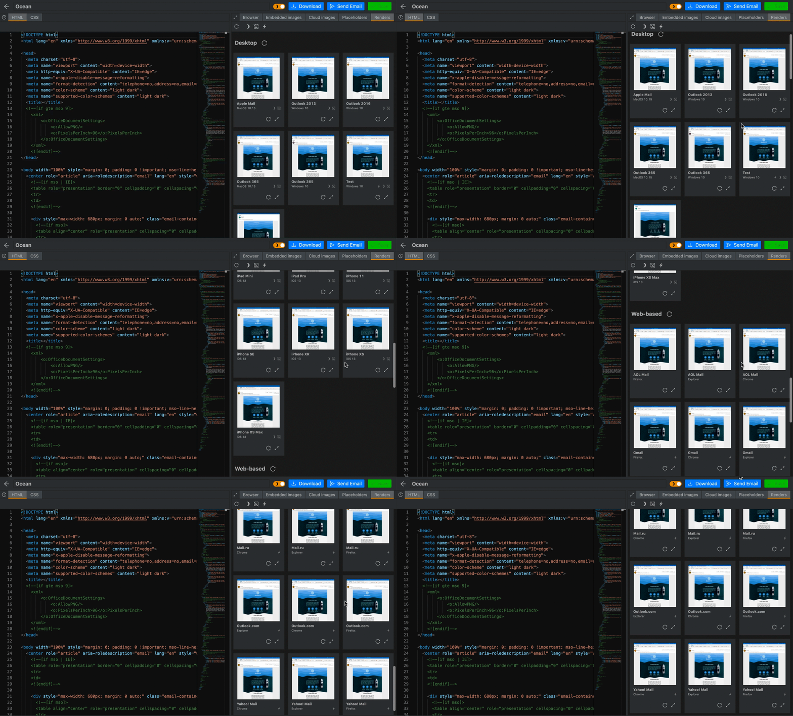 Email preview tool Email2Go
Next, in order to see how your template will be visible in email clients, click on the "Dark Mode" button either for all renderers at once, or for each device separately:
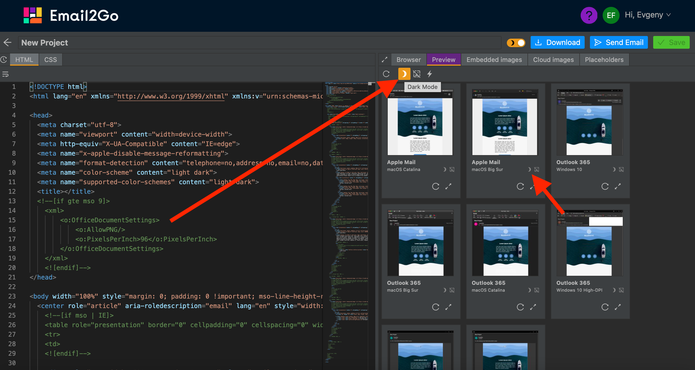 Email Dark Mode testing Email2Go
Testing your email templates is an important point in any marketing campaign, so do not neglect this, especially now that email testing has become easier, faster, and more accessible than ever before.

