The 8 Most Common Mistakes When Creating HTML Email Templates
How to avoid major mistakes when developing and testing email templates.

Undoubtedly, email is the strongest marketing tool in the work of more than 90% of companies nowadays. Given the development of this market, as well as the average ROI (about 4000%) and the number of users exceeding 3 billion worldwide, the forecast for 2021 for email is more than favorable.
But no matter what the market forecast is, or how great the marketing ideas are, absolutely nothing will work without a properly created email message.
By creating an HTML email that looks perfect on your computer, it may look completely different on the recipient's end. One of the reasons is that when creating email templates, you use CSS files, images, and fonts that are located on your local computer. When creating an email, it is important to understand that you are not creating a website but an email. If you forget about this, it is more likely that your beautiful, well-thought-out message will reach the final recipient in the form of an incomprehensible set of graphics and text, which will cause a negative reaction.
In this article, I have collected all the common mistakes when creating email templates to make your work more pleasant and productive. Let’s go!
External CSS File Links
Do not place links to external CSS files. Most email clients don't support these links. Use inline CSS instead of referencing an external CSS file, or by placing the CSS file in <head> email messages and calling it in <body>.
Creating code in the modern HTML email template builder will help you avoid this problem.

Invalid Width
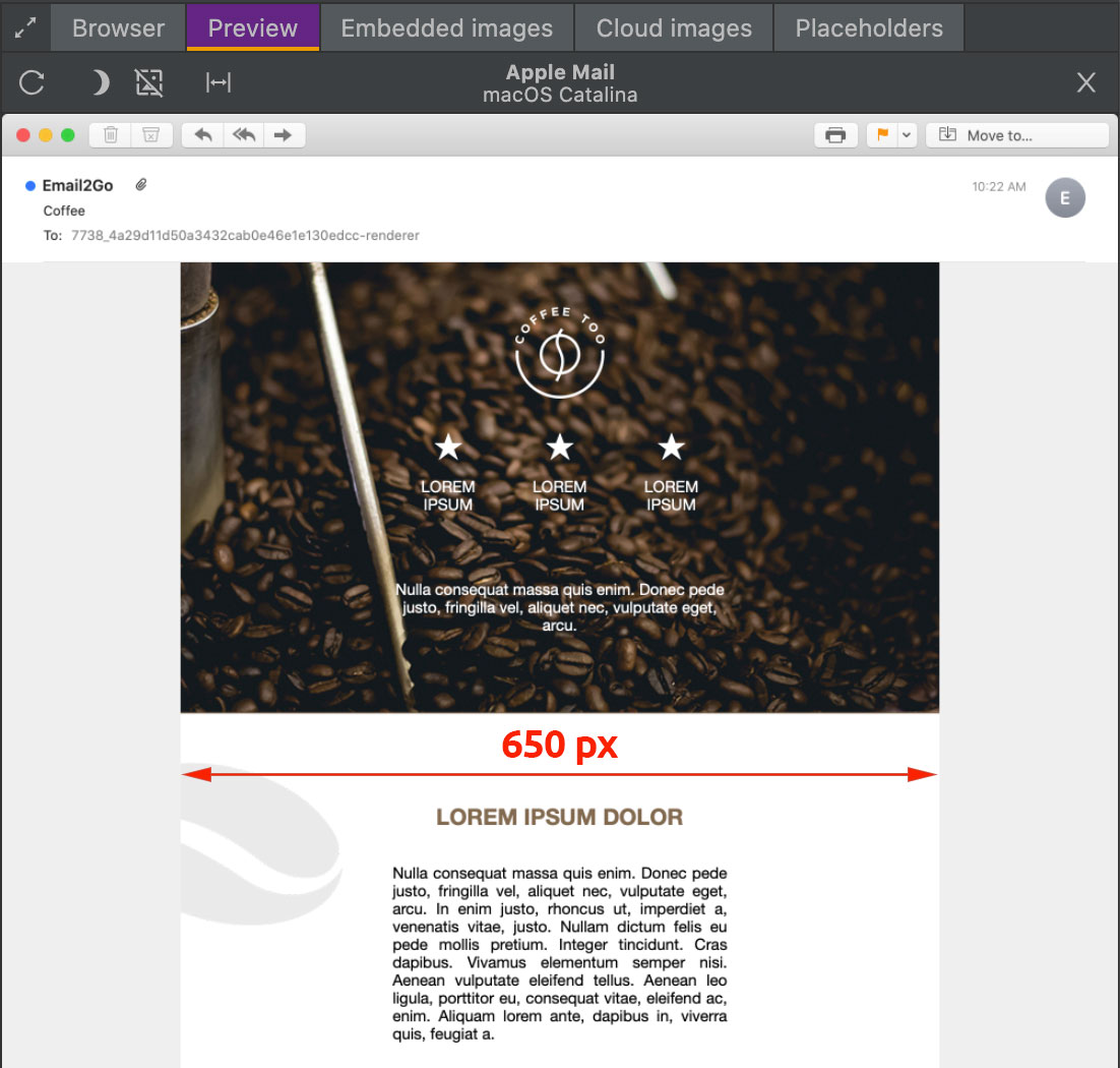
Do not forget about the standard – 650 pixels.
Don't make your email too wide. Otherwise, it simply won't fit in the viewport of most email clients. If you have any doubts about this rule, create a template and do beta testing of it. ‘650px rule’ will be 100 % confirmed.

Huge Graphic Emails
It's no secret that almost all email systems block automatic image uploads. After receiving a strange half-empty message, the recipient is likely to delete your message or even worse – moving it to spam. It's time to mention another golden rule for creating an email template – 80% text and 20% images.
It is worth mentioning that all spam filters determine a reasonable balance of graphics and text in different ways. Testing the email template will help you find the right ratio that is suitable for your email.
Local Images
When using images in email that are placed on your local server, we get another problem – the recipients of your message will not have access to this server and the template will look as if it came out of the shredder. There are two ways to avoid this:
JavaScript in HTML Email
As a security measure, almost all email apps block JavaScript. Don't use JavaScript in places like submit buttons, image pre-loaders, and pop-up window links. If you need to copy HTML from an existing web page, remove all JavaScript from this code. I strongly recommend that you thoroughly test your campaign before submitting it to make sure that it is displayed correctly.
Form Code
Forget it! Forget about using Form Code in HTML email templates forever, as they will be removed by all post programs. Also, avoid using iframes, as they are very outdated for modern email clients and are largely out of use.
Using <div> instead of <table>
Despite the <table> tag not being a good practice for creating web pages, it is the best option in creating HTML emails. Since most versions of Outlook do not support the box model, CSS grid, floats, etc., it is difficult to use semantic HTML to create email templates that work properly in Outlook.
and test them on dozens of different devises and mail apps START NOW


Email Templates Weren’t Tested
This is the most important thing. After spending a lot of effort and imagination in creating an email, check it carefully before sending. Don't forget that the message can be displayed completely differently in different email clients and applications. Errors, the offset of pictures, problems with fonts, incorrect backgrounds – all of these can appear on the screen at the final destination. Use the HTML email testing tool to ensure that your efforts in creating a mailing list are rewarded. Only after testing your template on all possible devices can you safely click on the ‘send’ button and be sure that you have done a great job.

