HTML Email Template Fonts
How to use the correct fonts in your newsletters.

Just 7 seconds. On average, a reader spends 7 seconds viewing an email, provided that they are interested in it. This time includes viewing the email subject, images, and headers. In the same 7 seconds, the reader decides whether to click the link or not. This decision largely depends on the font. If the message reads well and comfortably, the probability of conversion increases significantly.
For this topic, we will deal with fonts in HTML emails. I suggest you start by looking at the most popular fonts that are currently used in creating email templates.
Georgia
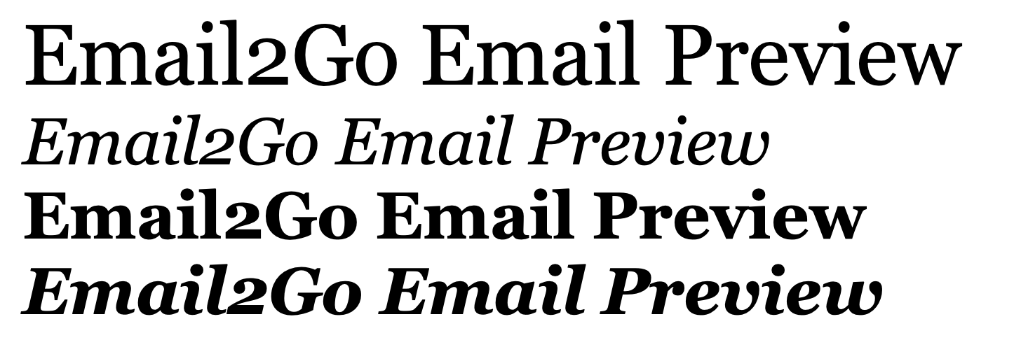 Georgia font (regular, italic, bold, bold italic)
The famous serif font—the short strokes at the end of the letter have been something of a lot of controversy. Some have argued that it makes it harder to read the text. But I am more inclined to the opinion of the typographer Gerry Leonidas, who claims that the serifs used in this font improve perception and contribute to reading the text to the end. They direct the movement of the eye when reading large amounts of text and do not tire a reader's vision.
Helvetica
This font is the absolute leader in the US and Europe. The simple and elegant sans-serif font was created in 1957 in Switzerland.
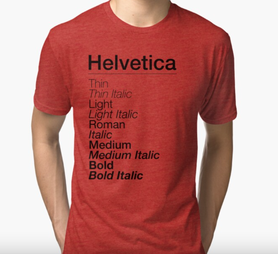 Helvetica font
This is a universal font that is used by many large corporations to communicate with their customers. If you receive an email from McDonald's, Toyota, Skype, or Nestle, you can be sure that it is in the Helvetica font.
Around 2013, there was talk in the email developer community that Helvetica was beginning to lose ground and would soon disappear from all logos, emails, and web sites, and stop being used entirely.
Conversations remained simply conversations. It is already the end of 2020 and Helvetica is still considered the #1 font for creating emails and is not going to give up its position. An important fact is that the Apple Mail email app uses Helvetica as its default font.
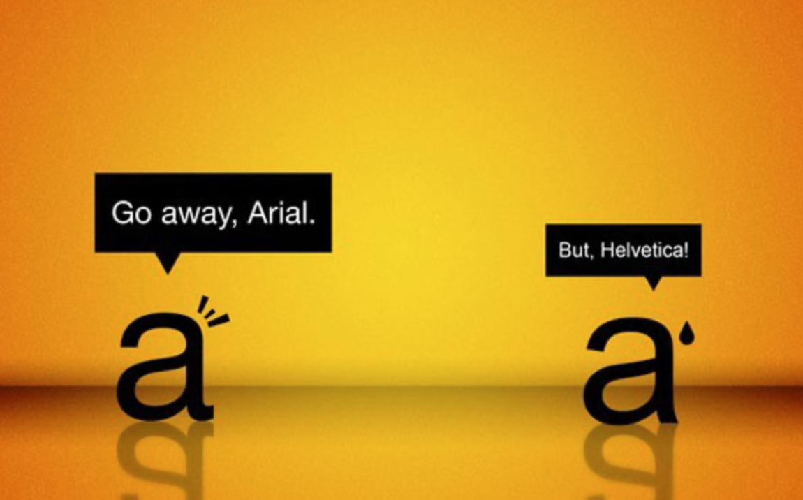
Arial
This is another popular computer font that was created based on Helvetica in 1982—it’s universal, simple, neutral, and without unnecessary elements.
 Helvetica and Arial
The standard Helvetica and Arial fonts are so similar that many people who are not experienced in fonts can hardly distinguish one from the other.
Gmail uses Arial by default. If the browser does not support Arial—which is extremely rare—then it automatically switches to Helvetica.
I don't recommend using Arial in long text messages because they will look monotonous and boring.
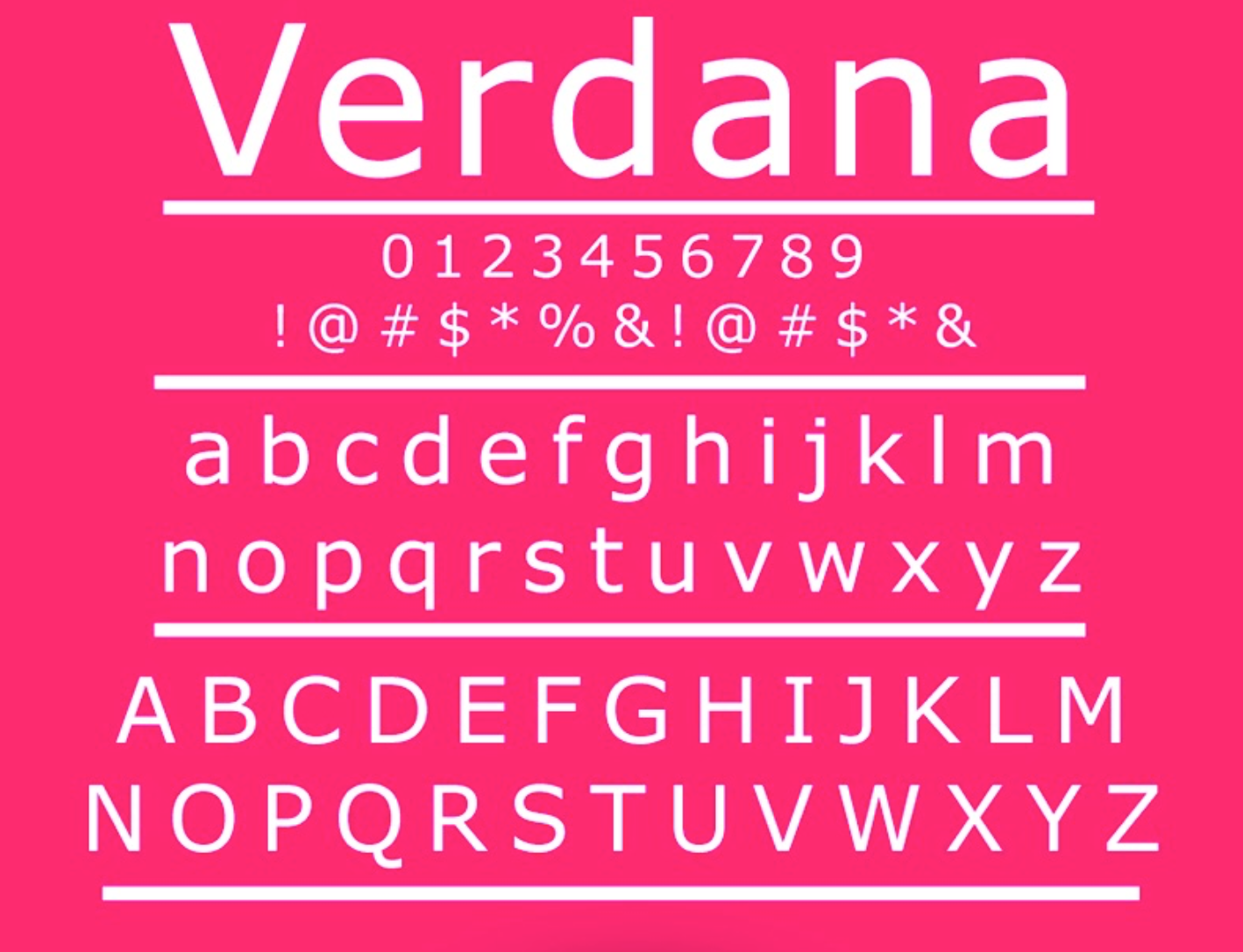
Verdana
There are no serifs in the Verdana font. One of the main features of this font is a wide gap inside the letters. Text written using Verdana is very pleasant to read because the letters have an open form.
 Verdana font
Given that this font was specially created for easy reading of texts from a screen, it is ideal for email newsletters.
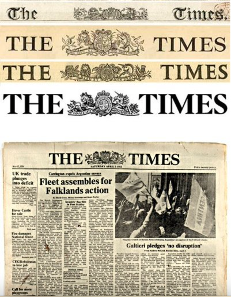
Times New Roman
The font was created in 1932 specifically for the London newspaper The Times to save space when typing and at the same time increase readability. Times New Roman has high lowercase letters, slightly compressed, with short descending and ascending letters.
Currently, Times New Roman is very actively used in official documents and academia. Therefore, if you want to move away from officialdom in your email, I do not recommend using this font.
Secure Fonts for Email Templates
When creating an HTML email, keep in mind that email clients do not accept all fonts. Here is a list of the most secure fonts. They will be displayed correctly on all email clients and applications.
- Arial
- Courier
- Arial Black
- Courier New
- Tahoma
- Georgia
- Treduchet MS
- Times
- Verdana
- Times New Roman
In the case of fonts, progress has finally reached HTML email design. Many popular email programs, such as Gmail and Apple Mail, have started adding support for web fonts. Of course, you can also use "unsafe" fonts for your emails. In this case, you need to be careful and specify in your code what font the mail program should use if it has problems with the image of the font you used and this spare font should be from the list that I indicated above. To be sure that the fonts will be displayed correctly, you need to test your template on all devices and apps using Email2Go.
Fonts in Outlook
I would like to draw your attention to the fact that desktop versions of Outlook will transfer all your fonts to Times New Roman. There is a way to overcome this inconvenience imposed on us by Microsoft, though.
In your email template code, you need to add:
<!--[if mso]>
<style type=”text/css”>
.fallback-text {
font-family: Arial, sans-serif;
}
</style>
<![endif]-->
And then, we use the "fallback-text" class when we need to get rid of the standard Times New Roman:
<td class="fallback-text" style="font-family: 'Open Sans', Arial, sans-serif;">
  Open sans font for all!
</td>
Tips for Choosing Fonts
-
Using different fonts for the title and paragraphs.
There are no specific instructions for this, it all depends on your imagination, corporate style, and capabilities of the mail program. My personal opinion is to alternate fonts with serifs and without. It creates a beautiful result. -
Keeping decorative fonts to a minimum.
They do not read well in large emails and are not always displayed correctly in the mail. But an exquisite rare font can be safely used in photos and illustrations. -
Follow the email style.
The font complements the content of the text. For instance, it would be strange to see your company's progress report in Comic Sans. -
Select 2 to 3 as your main fonts.
And use them constantly. They are your business card. Let the reader get used to your style. Two or three fonts are enough for recognition.